Entity Hero
A hero section component for displaying entity details with full-width image background, glassmorphism panels, and animated content. Supports ViewTransition for smooth page transitions.
Installation
$ npx shadcn@latest add @orecus/entity-heroDependencies:
motion
Registry:
skeleton@orecus/use-reduced-motion@orecus/color-utils
Component
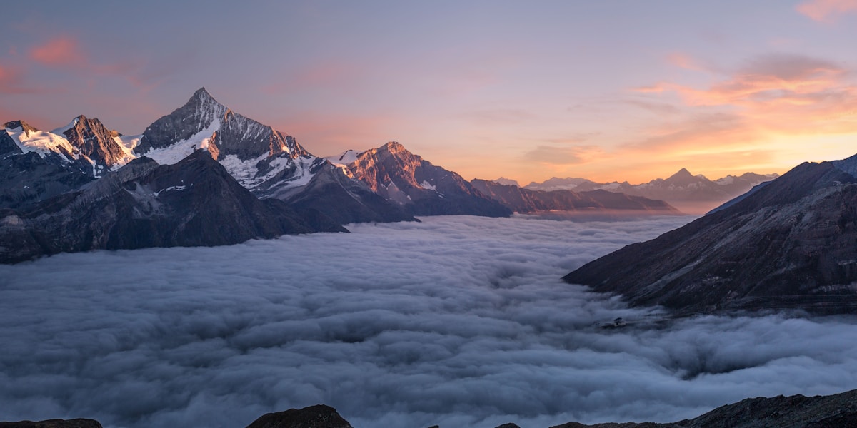
Mountain Vista Resort
A luxury mountain retreat featuring stunning panoramic views and world-class amenities.
Props
| Prop | Type | Default | Description |
|---|---|---|---|
entity* | T extends BaseEntity | undefined | null | — | The entity data to display. Shows skeleton when undefined/null. |
image* | HeroImage<T> | — | Image configuration with key, alt, and fallback URL |
ImageComponent | React.ElementType | 'img' | Image component to use (e.g., next/image for Next.js) |
panelType | 'normal' | 'subtle' | 'strong' | 'normal' | Glass panel type for all content panels |
panelInvert | boolean | true | Use inverted glass style (light on light, dark on dark) |
height | 'sm' | 'md' | 'lg' | 'md' | Height preset (sm: 250/300px, md: 300/400px, lg: 400/500px) |
className | string | — | Additional CSS classes |
Compound Components
EntityHero.Above
Content at the very top of the hero, above TopLeft/TopRight. Useful for embedded page headers.
| Prop | Type | Default | Description |
|---|---|---|---|
panel | boolean | false | Whether to show glass panel background |
className | string | — | Additional CSS classes |
EntityHero.TopLeft
Content in the top left corner
| Prop | Type | Default | Description |
|---|---|---|---|
panel | boolean | false | Whether to show glass panel background |
className | string | — | Additional CSS classes |
EntityHero.TopRight
Content in the top right corner
| Prop | Type | Default | Description |
|---|---|---|---|
panel | boolean | false | Whether to show glass panel background |
className | string | — | Additional CSS classes |
EntityHero.Header
Content above the main panel (e.g., category badge)
| Prop | Type | Default | Description |
|---|---|---|---|
panel | boolean | true | Whether to show glass panel background |
className | string | — | Additional CSS classes |
EntityHero.Content
Main content panel for title, description, and custom content
| Prop | Type | Default | Description |
|---|---|---|---|
panel | boolean | true | Whether to show glass panel background |
className | string | — | Additional CSS classes |